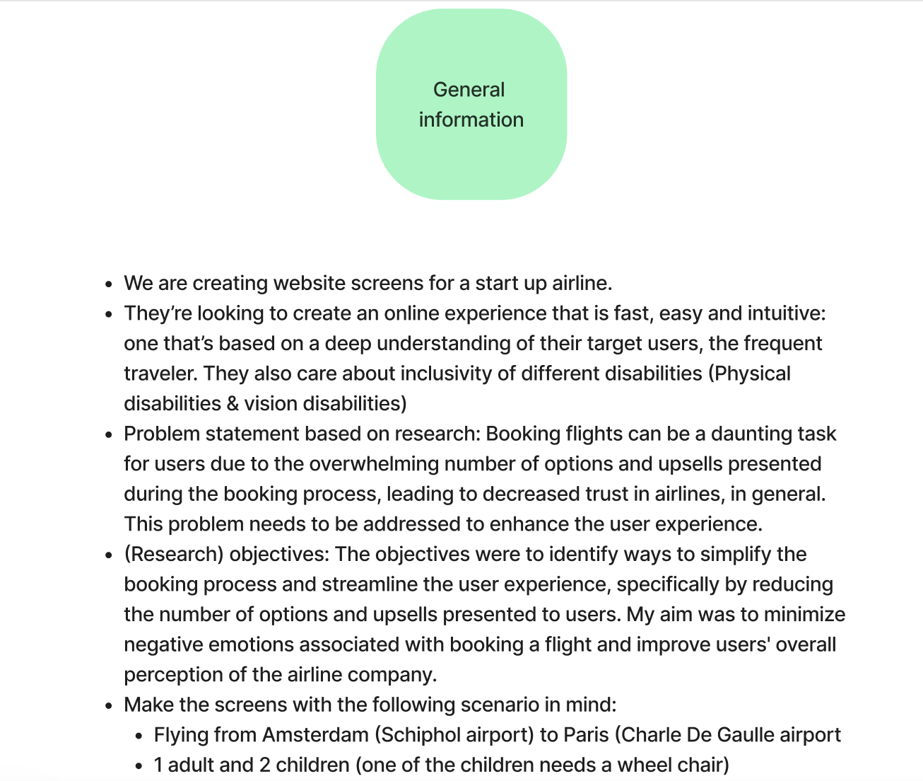
Horizon Wings – Startup Airline

  • Client Horizon Wings (fictional airline company)
  • My role UX Research (also created mid-fidelity prototypes)
  • Team Hayate Ait Bouzid, and I collaborated with a UI Designer to create some High-fidelity Designs
  • Methods Competitive analysis, Usability tests, Interviews, Affinity Mapping, Customer Journey mapping, User Flow, Sketching, Testing prototype
  • Tools Figma, Mural, Sketch, Zoom

Pinning Down the Problem

The client was a start-up airline. They’re looking to create an online experience that is fast, easy and intuitive: one that’s based on a deep understanding of their target users, the frequent traveler. My role was to enhance the booking process of their website while applying the complete UX process. My focus was on how users search and select flights.

Research Objectives

My research objectives were to identify ways to simplify the booking process and streamline the user experience, specifically by reducing the number of options and upsells presented to users. My aim was to minimize negative emotions associated with booking a flight and improve users’ overall perception of the airline company.

Problem statement

Booking flights can be a daunting task for users due to the overwhelming number of options and upsells presented during the booking process, leading to decreased trust in airlines, in general. This problem needs to be addressed to enhance the user experience.

‘If I could avoid booking flights, I would. It’s just too stressful. I prefer booking hotels.’
Gaya
Respondent

Crafting my Research Approach

To build the UX Fly website from scratch and with no existing audience, I began by conducting competitive benchmarking in the airline industry. This step informed my research process for the project. Based on my findings, I decided that usability tests on a mix of low-cost and national airlines would be the best research method. When selecting airlines for the tests, I ensured that each had a unique element in their booking process that others did not have. The selected airlines were Eurowings, Aer Lingus, Emirates, and Finnair.

This approach enabled me to observe user reactions to a range of different features and booking processes. Each user tested two airlines in one session, allowing me to evaluate the strengths and weaknesses of each airline independently and in comparison to one another. Before conducting the usability tests, I also interviewed users to gain insight into their travel habits and past experiences with airlines. This added valuable context to their decision-making and feedback during the usability tests.

My process in images

To get access to the deliverables in detail, scroll down to the section ‘All deliverables ‘

Understand
Understanding the airline industry

I performed a competitor analysis among different airlines. I used this data and the objectives the client gave to define my interview questions and usability script.

Research
Interviews & Usability tests

To build an effective initial prototype, I conducted usability tests on existing airline websites to gain firsthand understanding of user experiences with current airlines.

Users tested two airlines in one session, enabling a comparison of strengths and weaknesses. Prior to usability tests, I conducted interviews to understand travel habits and past airline experiences.

Analyze
Extracting value from research

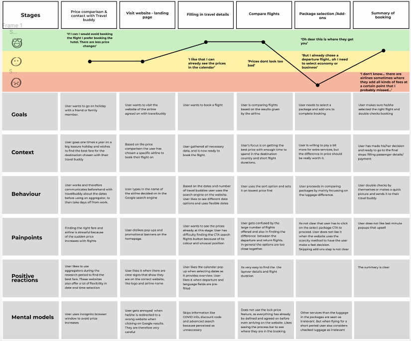
I analyzed the data from my research to understand the things that worked when booking an airline and what didn't work. I did this through affinity mapping, followed by customer journey mapping. 

Sketching
Sketching for a seamless experience

The data from the analysis phase helped me to define a user flow that I captured in the tool Sketch. Based on the user flow I then started sketching by hand in my digital notebook. 

Prototype
Building Better Experiences

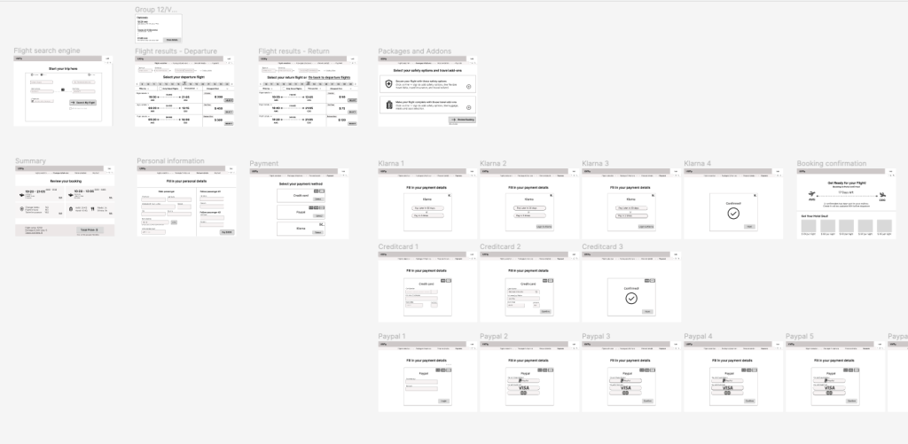
I build a prototype from searching flights up to the confirmation screen of a booked flight. This prototype was built in Figma. 

Testing
Mid-fidelity prototype: Design Validation

After creating a prototype, I decided to test this with a new set of users. Based on the tests, I could see that the users enjoyed the simple interface and how straightforward it is to book a flight. However, there was room for improvement in how certain information was displayed. 

Design
High-fidelity Designs

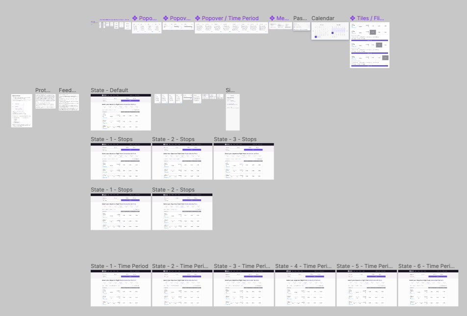
After analyzing the data from testing the prototype, I collaborated with a UI Designer to create polished screens for my portfolio as the final product.
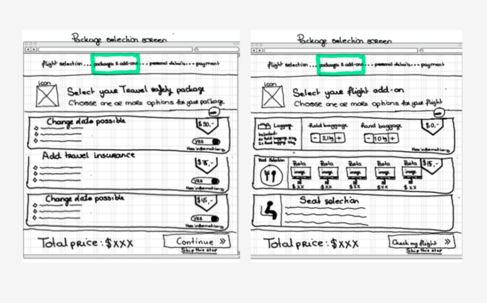
From Obstacles to Opportunities

After conducting the interviews and usability tests, I analyzed all the transcriptions and notes. It was a manual process where I searched for patterns across the complete dataset. To uncover themes that could be used for prototyping the booking process for UX Fly, I also conducted an affinity mapping workshop. Additionally, I created a customer journey that allowed me to analyse each step of the booking process in detail. This helped me identify important mental models and behaviors that took place even before users arrived on the website. In a real situation, I would communicate this to the Marketing department, specifically the SEO and SEA team.

During the data analysis process, I discovered many friction points that hindered the booking process for users. However, what was more concerning was that these friction points were impacting the reputation of the airline industry as a whole. As I moved into the prototype phase, I realized that most of these friction points could be solved by incorporating simple heuristics.

Add-ons

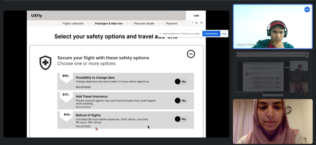
  •  For the participants the add-ons caused a lot of frustration. This is often the step where they would take the most time or get stuck.Part of this hurdle is because the add-ons were not always part of the progress bar on top. Participants had to select add-ons directly during the flight selection. In my own design I made sure to consider the add-ons a separate step in the booking flow.  Through the progress bar on top of each page after the flight search engine I assured that the user always knows which steps they have completed and which ones come next. 

Calendar

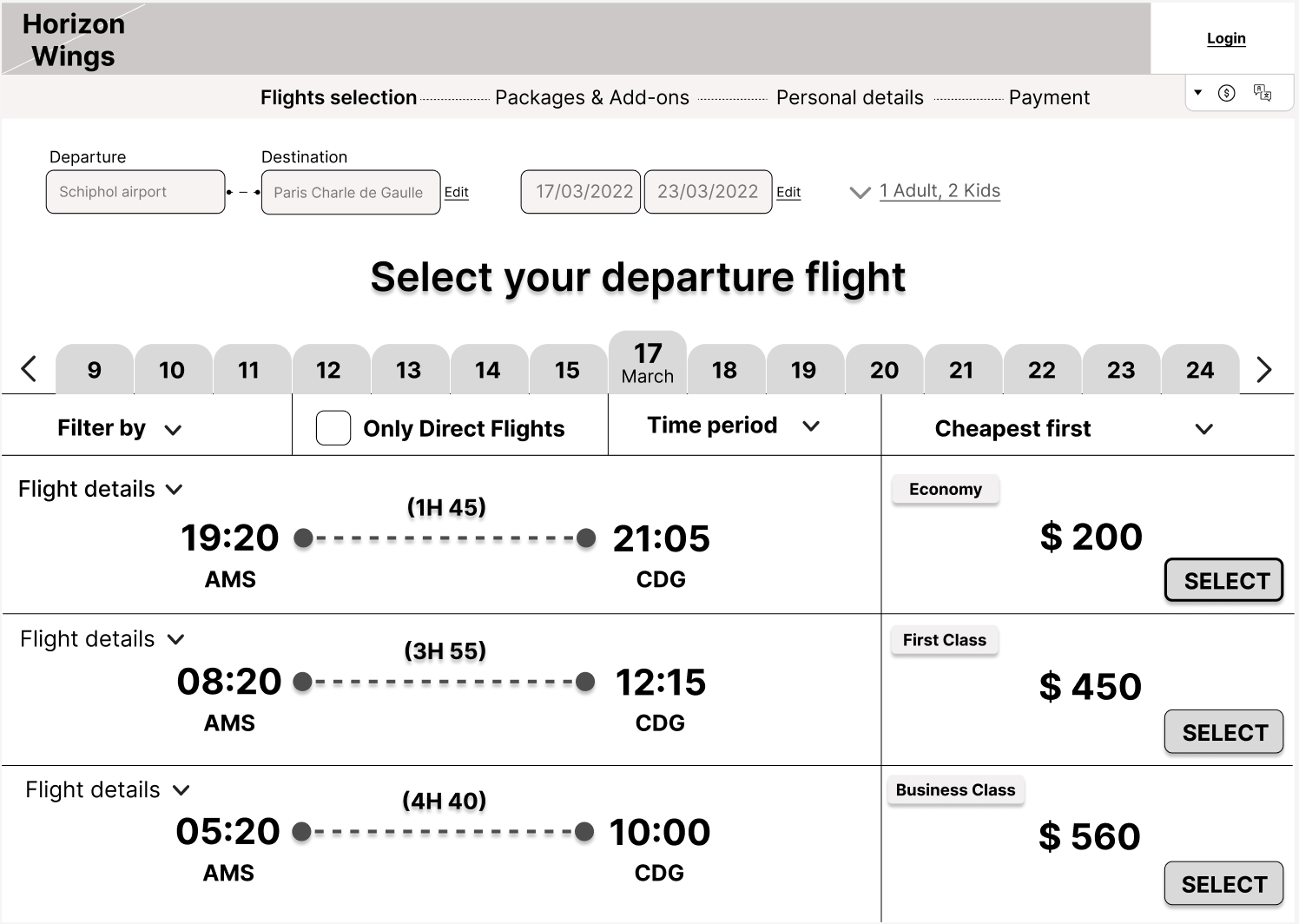
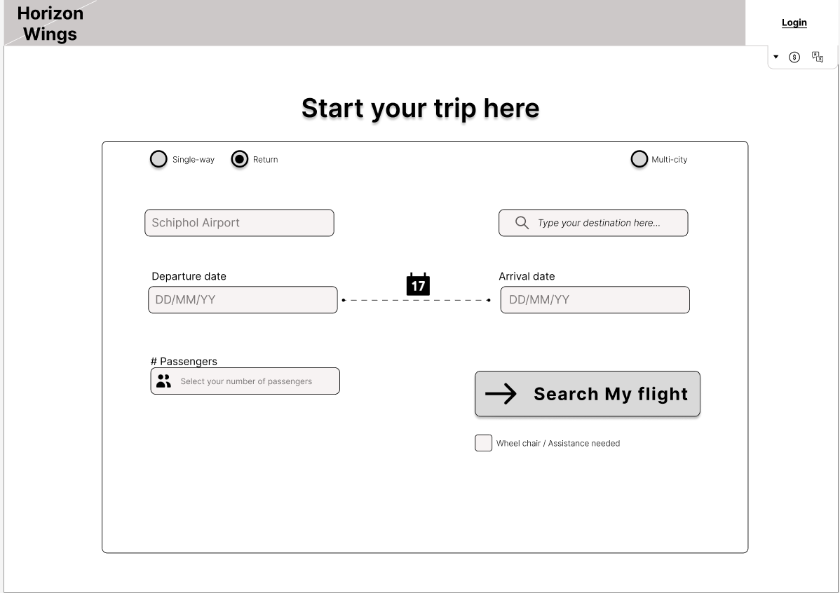
  • Participants liked when a calendar gave feedback when the departure and return date were selected through highlighting the date range. In the prototype I made sure to keep this experience. 

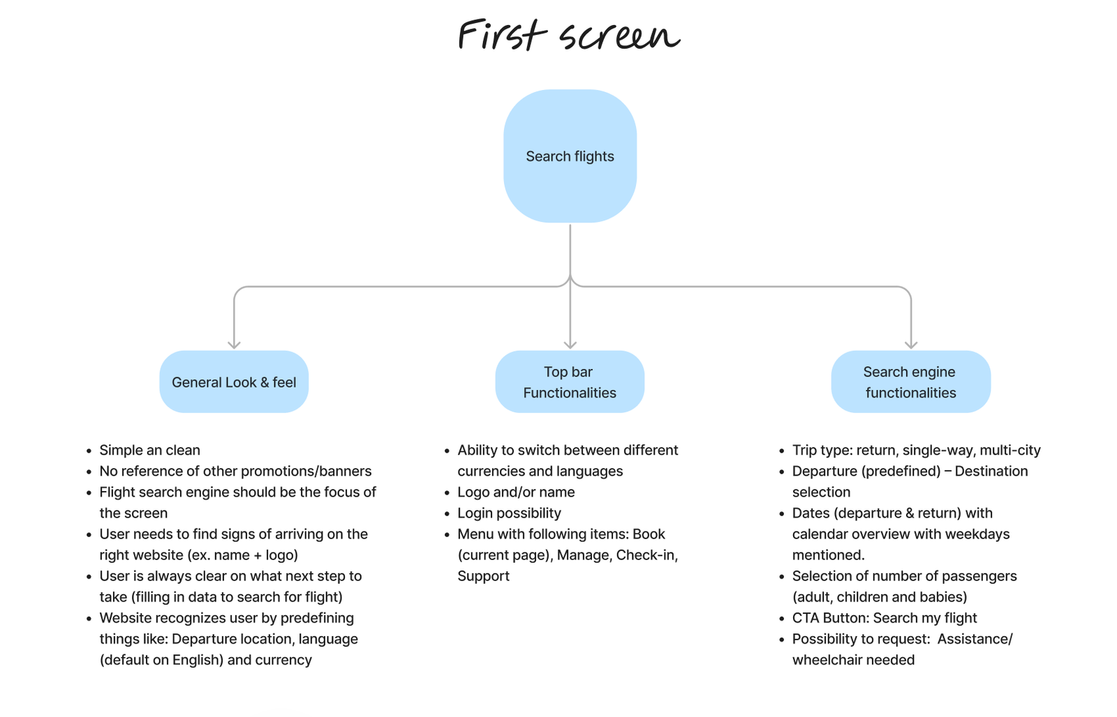
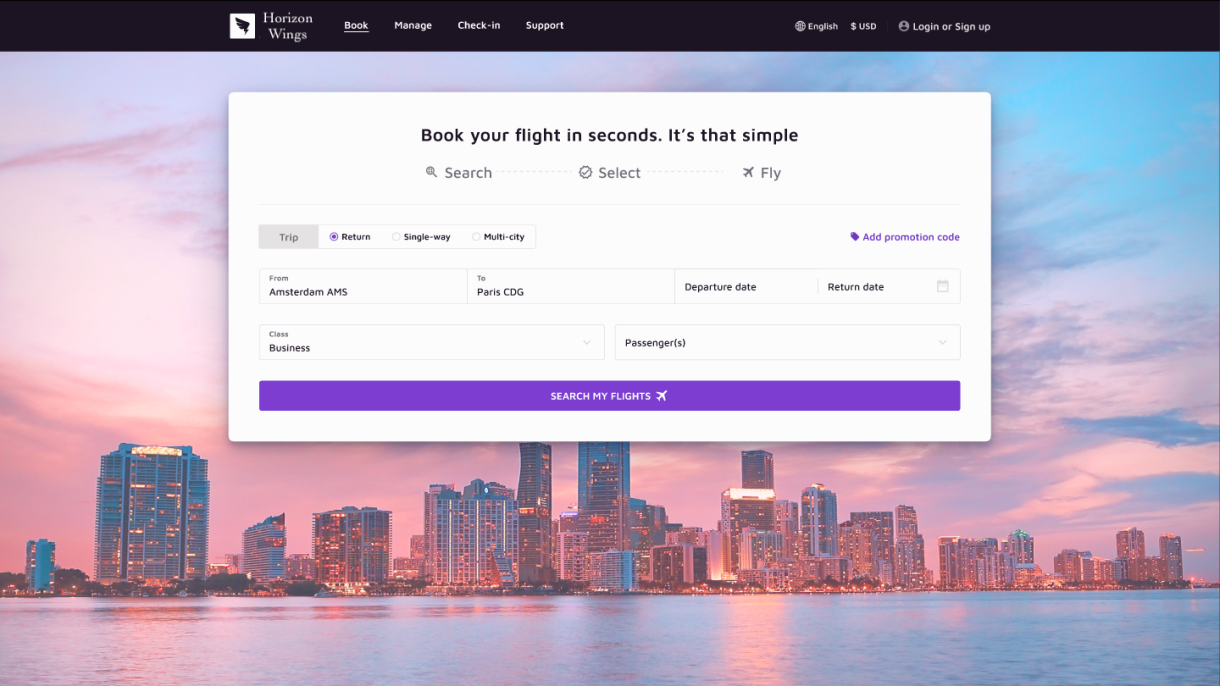
Search flight engine

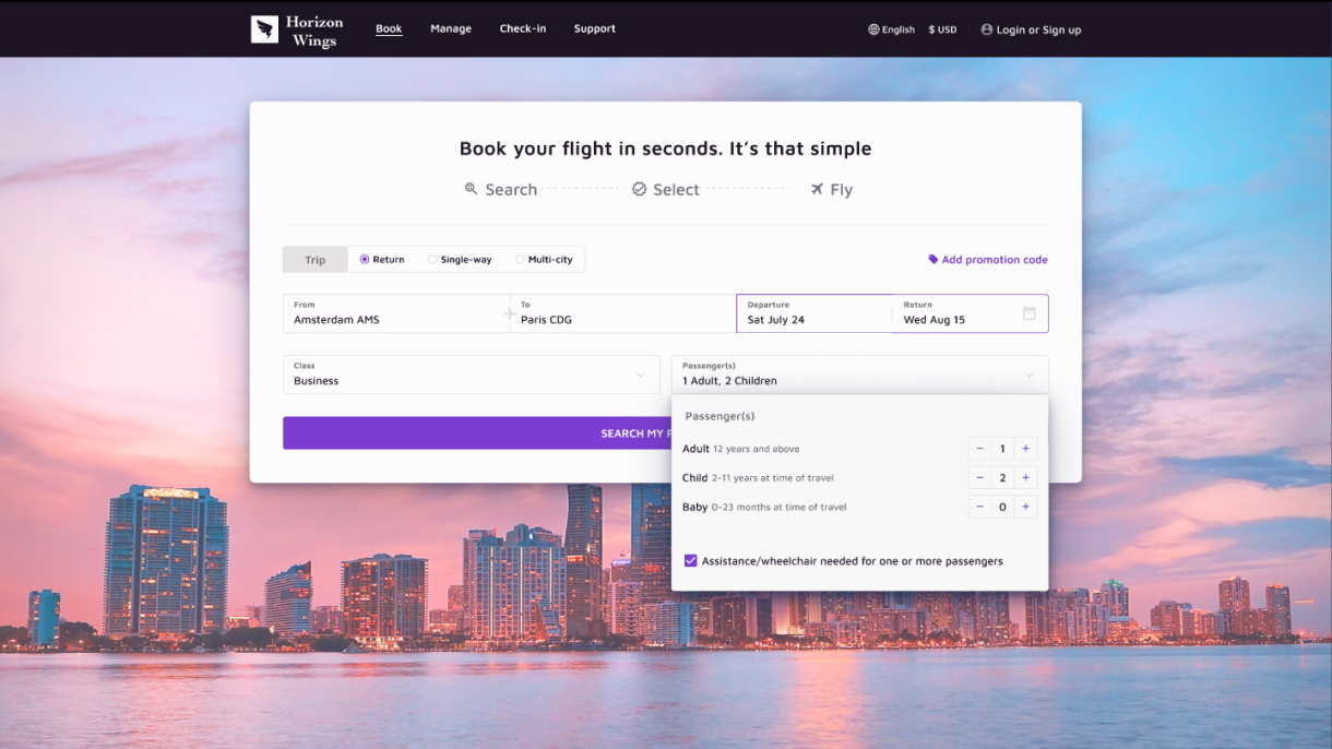
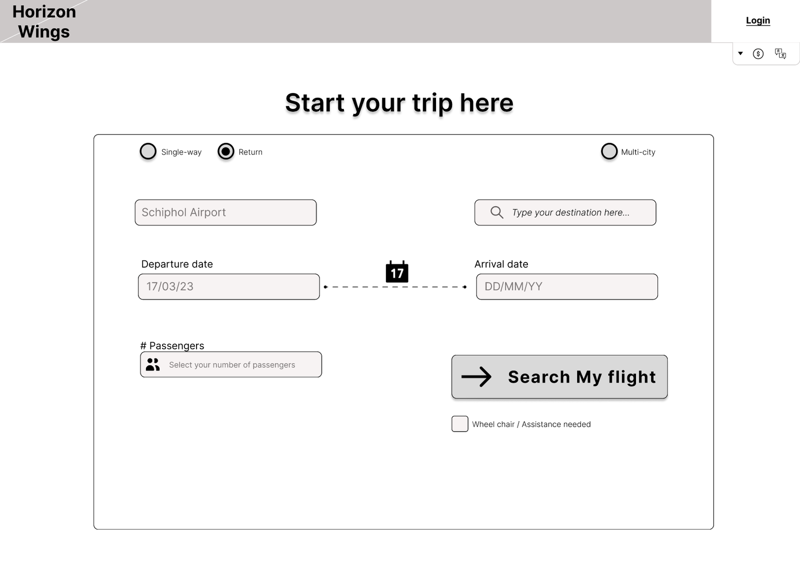
  • Majority of the websites tested showed the discount code at the very beginning when searching for a flight. Participants found that this didn't make sense to them as for them a discount code belongs to the checkout step. In my prototype I decided to move the discount code to the payment step. 
  • In my own prototype I also decided to add icons for the date selection and the passenger field as during the usability tests a few participants passed over the fields and went straight for the search flight CTA. 
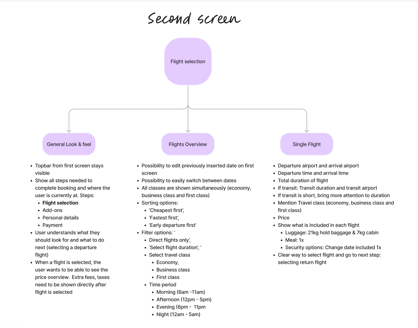
  • Flight selection page

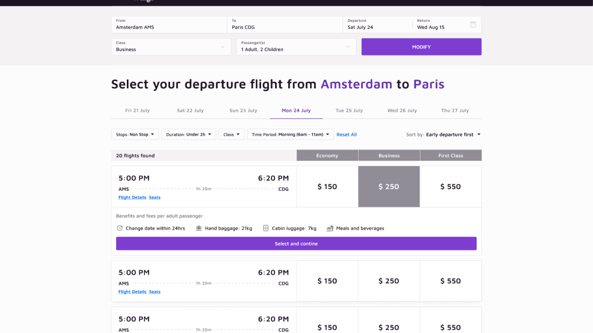
Based on the interview I understood that the participants like to test different dates and times before making a final decision. Therefore in my prototype I made it very easy to edit the flight search query right from the flight selection screens. I also created a design where one can easily switch between dates on the search results page without having to edit any search query.


  • Add-ons

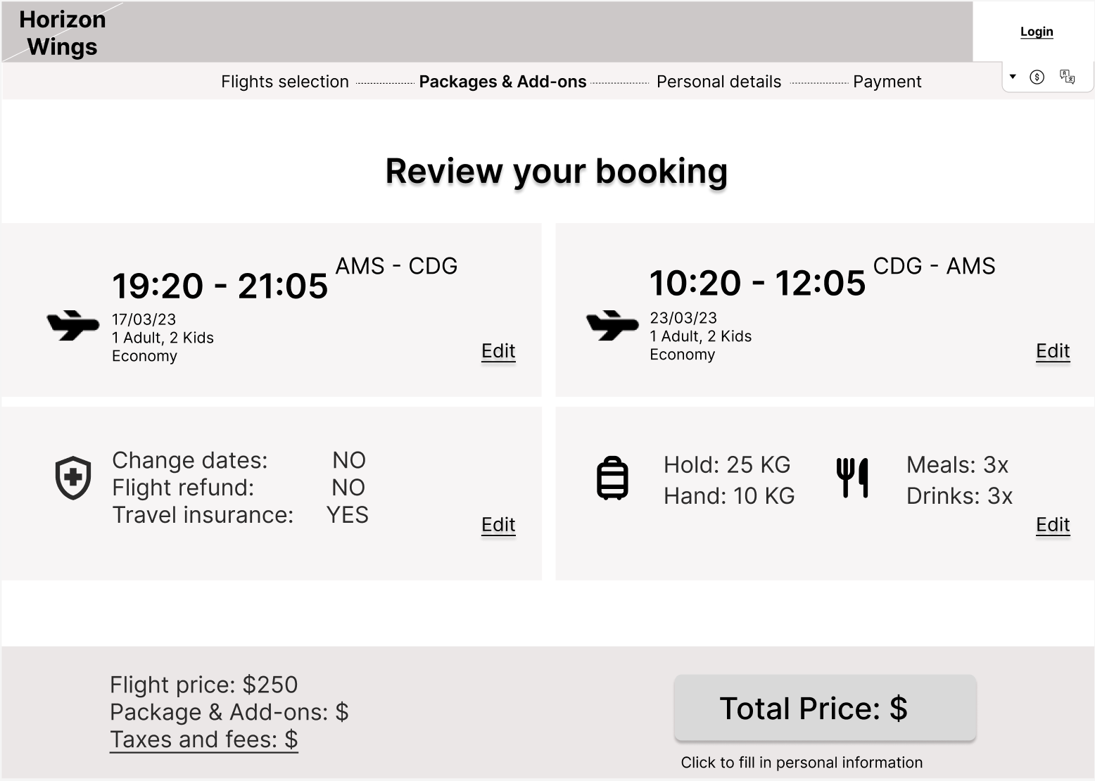
As mentioned before, for the participants the add-ons caused a lot of frustrations. Add-ons caused the participants to lose time or even get stuck. It was clear from the interviews and usability tests that the participants didnt have much interest in the add-ons. There major interest was in having enough luggage. In my own prototype I decided to add a very clear 'skip' button.


Calendar

During the usability tests the participants mentioned that they appreciate it when a calender highlights the selected date range. This helps them to prevent selecting the wrong date range. 

Payment


For the creditcard payment  formatting for the input field is error-proof depending on the card used. 

Summary


This page is where the user is presented with the selected flights and all the options attached to it. During the usability test it was clear that the participants didn't like spending too much time the details written on the summary. Going too fast during this step might cause users to overlook mistakes. For this reason in my own prototype I made sure to provide a clear summary divided into four distinctive areas. 


Homepage

From the usability tests it was clear that the homepages of some of the test websites were considered to be too crowded with different services and ads. For this reason in my prototype the flight search engine has a central position on the position and no other banners or ads are shown. 


Validating the Prototype

After working on the mid-fidelity prototype I tested it again with my participants through usability tests where they had to go through a set of tasks that allowed them to go through the whole booking process. There were a lot of positives, but also as expected, some room for improvement. These are the insights from this round of usability tests:

Positives

  • All liked the minimalistic design and the focus on the Flight Search engine. 
  • In my mid-fidelity design, I also added the possibility of requesting assistance and a wheelchair. The participants liked the inclusion and accessibility that resulted from this. 
  • The ease of transitioning from one date to another within the flight results without having to edit the whole search query was also appreciated
  • The number of filters was appreciated as it allowed the participants to really filter based on their needs
  • The summary page was very clear and offered the participants a clear overview of what they selected during the process
  • The final page of a successful was very much appreciated as it gave the participants useful information (e.g. how many days were left for the trip) and was not too cluttered. 

Room for improvement

  • The filters on the Flight results should be brought together and take up less space.
  • The flight details need to be more clearly visible. Instead of having to click on a separate button for the flight details, participants preferred if details like transit duration and location would directly be visible. 
  • Participants were confused as to what was exactly included in a flight ticket. This needed to be clearly visible. 
  • The UI of the add-ons could be better. When adding luggage, the connection between the increase of weight and the price was not clear. 
  • The UI of the total price was shown as a button to go to the next step. This caused a lot of confusion as the participants didn’t expect it to be a button. 
  • The verification of the phone number during the personal details steps caused for confusion as it had too many steps
  • Participants wished to see the price overview from the very moment they select the departure flight with all fees and taxes

Iteration Based on Feedback

After testing my prototype with a set of participants, I was able to improve my prototype and collaborate with a UX designer to deliver an example high-fidelity prototype. I usually don’t do this step as a UX researcher, as my strength lies in analyzing the data and providing actionable recommendations. However, I decided to add this step to show efficient collaboration with a UX designer in case this is needed for future clients. For the final result please refer to the last section ‘All deliverables’

My Research Reflection

This was my first UX project where design was also involved. Through this project, I learned new things like creating prototypes on Figma and collaborating with a UX designer on a high-fidelity prototype. 

Another important point is that I did my best to not fully get taken away by the participants’ opinions, but to also keep in mind the business value. In the eyes of the participants, the whole add-ons section was causing a lot of frustration around the price increase and could have been easily omitted. However, for a business, it is important to keep this step in the process to increase the revenue. So through this research, I was able to find a way to please both parties by just restructuring the whole step.