Projects
- Home
- Projects
Pinning Down The Problem
The client was a start-up airline. They’re looking to create an online experience that is fast, easy and intuitive: one that’s based on a deep understanding of their target users, the frequent traveler. My role was to enhance the booking process of their website while applying the complete UX process. My focus was on how users search and select flights.
Research Objectives
My research objectives were to identify ways to simplify the booking process and streamline the user experience, specifically by reducing the number of options and upsells presented to users. My aim was to minimize negative emotions associated with booking a flight and improve users’ overall perception of the airline company.
Problem statement
Booking flights can be a daunting task for users due to the overwhelming number of options and upsells presented during the booking process, leading to decreased trust in airlines, in general. This problem needs to be addressed to enhance the user experience.
‘If I could avoid booking flights, I would. It’s just too stressful. I prefer booking hotels.’
Gaya
Respondent
Crafting my Research Approach
To build the UX Fly website from scratch and with no existing audience, I began by conducting competitive benchmarking in the airline industry. This step informed my research process for the project. Based on my findings, I decided that usability tests on a mix of low-cost and national airlines would be the best research method. When selecting airlines for the tests, I ensured that each had a unique element in their booking process that others did not have. The selected airlines were Eurowings, Aer Lingus, Emirates, and Finnair.
This approach enabled me to observe user reactions to a range of different features and booking processes. Each user tested two airlines in one session, allowing me to evaluate the strengths and weaknesses of each airline independently and in comparison to one another. Before conducting the usability tests, I also interviewed users to gain insight into their travel habits and past experiences with airlines. This added valuable context to their decision-making and feedback during the usability tests.
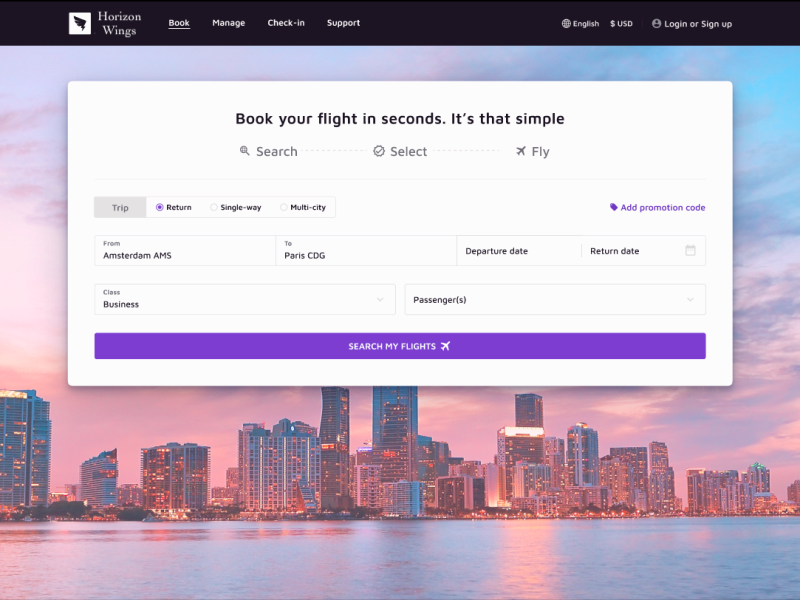
Horizon Wings – Startup Airline
- Client Horizon Wings (fictional airline company)
- My role UX Research (also created mid-fidelity prototypes)
- Team Hayate Ait Bouzid, and I collaborated with a UI Designer to create some High-fidelity Designs
- Methods Competitive analysis, Usability tests, Interviews, Affinity Mapping, Customer Journey mapping, User Flow, Sketching, Testing prototype
- Tools Figma, Mural, Sketch, Zoom
Pinning Down the Problem
The client was a start-up airline. They’re looking to create an online experience that is fast, easy and intuitive: one that’s based on a deep understanding of their target users, the frequent traveler. My role was to enhance the booking process of their website while applying the complete UX process. My focus was on how users search and select flights.
Research Objectives
My research objectives were to identify ways to simplify the booking process and streamline the user experience, specifically by reducing the number of options and upsells presented to users. My aim was to minimize negative emotions associated with booking a flight and improve users’ overall perception of the airline company.
Problem statement
Booking flights can be a daunting task for users due to the overwhelming number of options and upsells presented during the booking process, leading to decreased trust in airlines, in general. This problem needs to be addressed to enhance the user experience.
‘If I could avoid booking flights, I would. It’s just too stressful. I prefer booking hotels.’
Gaya
Respondent
Crafting my Research Approach
To build the UX Fly website from scratch and with no existing audience, I began by conducting competitive benchmarking in the airline industry. This step informed my research process for the project. Based on my findings, I decided that usability tests on a mix of low-cost and national airlines would be the best research method. When selecting airlines for the tests, I ensured that each had a unique element in their booking process that others did not have. The selected airlines were Eurowings, Aer Lingus, Emirates, and Finnair.
This approach enabled me to observe user reactions to a range of different features and booking processes. Each user tested two airlines in one session, allowing me to evaluate the strengths and weaknesses of each airline independently and in comparison to one another. Before conducting the usability tests, I also interviewed users to gain insight into their travel habits and past experiences with airlines. This added valuable context to their decision-making and feedback during the usability tests.
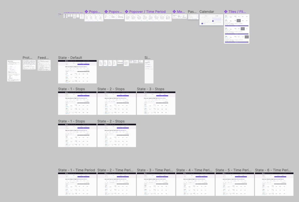
My process in images
To get access to the deliverables in detail, scroll down to the section ‘All deliverables ‘
Understand

Understanding the airline industry
I performed a competitor analysis among different airlines. I used this data and the objectives the client gave to define my interview questions and usability script.
Research
Interviews & Usability tests
To build an effective initial prototype, I conducted usability tests on existing airline websites to gain firsthand understanding of user experiences with current airlines.
Users tested two airlines in one session, enabling a comparison of strengths and weaknesses. Prior to usability tests, I conducted interviews to understand travel habits and past airline experiences.
Analyze
Extracting value from research
I analyzed the data from my research to understand the things that worked when booking an airline and what didn't work. I did this through affinity mapping, followed by customer journey mapping.
Sketching
Sketching for a seamless experience
The data from the analysis phase helped me to define a user flow that I captured in the tool Sketch. Based on the user flow I then started sketching by hand in my digital notebook.
Prototype
Building Better Experiences
I build a prototype from searching flights up to the confirmation screen of a booked flight. This prototype was built in Figma.
Testing
Mid-fidelity prototype: Design Validation
After creating a prototype, I decided to test this with a new set of users. Based on the tests, I could see that the users enjoyed the simple interface and how straightforward it is to book a flight. However, there was room for improvement in how certain information was displayed.
Design
High-fidelity Designs
After analyzing the data from testing the prototype, I collaborated with a UI Designer to create polished screens for my portfolio as the final product.
From Obstacles to Opportunities
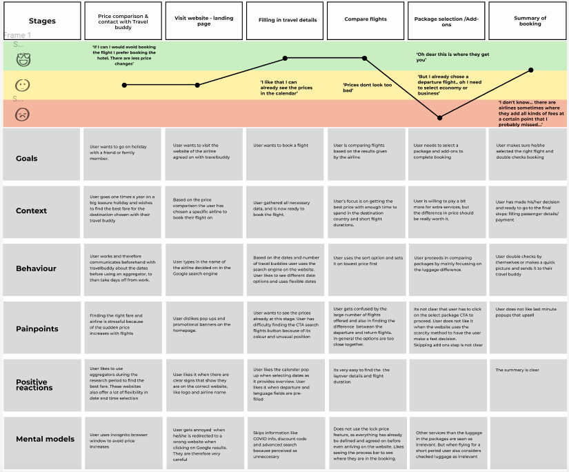
After conducting the interviews and usability tests, I analyzed all the transcriptions and notes. It was a manual process where I searched for patterns across the complete dataset. To uncover themes that could be used for prototyping the booking process for UX Fly, I also conducted an affinity mapping workshop. Additionally, I created a customer journey that allowed me to analyse each step of the booking process in detail. This helped me identify important mental models and behaviors that took place even before users arrived on the website. In a real situation, I would communicate this to the Marketing department, specifically the SEO and SEA team.
During the data analysis process, I discovered many friction points that hindered the booking process for users. However, what was more concerning was that these friction points were impacting the reputation of the airline industry as a whole. As I moved into the prototype phase, I realized that most of these friction points could be solved by incorporating simple heuristics.
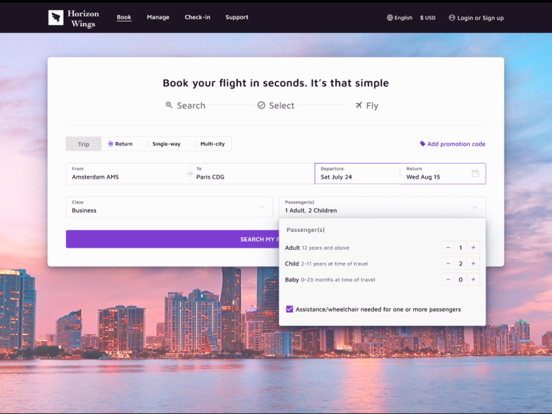
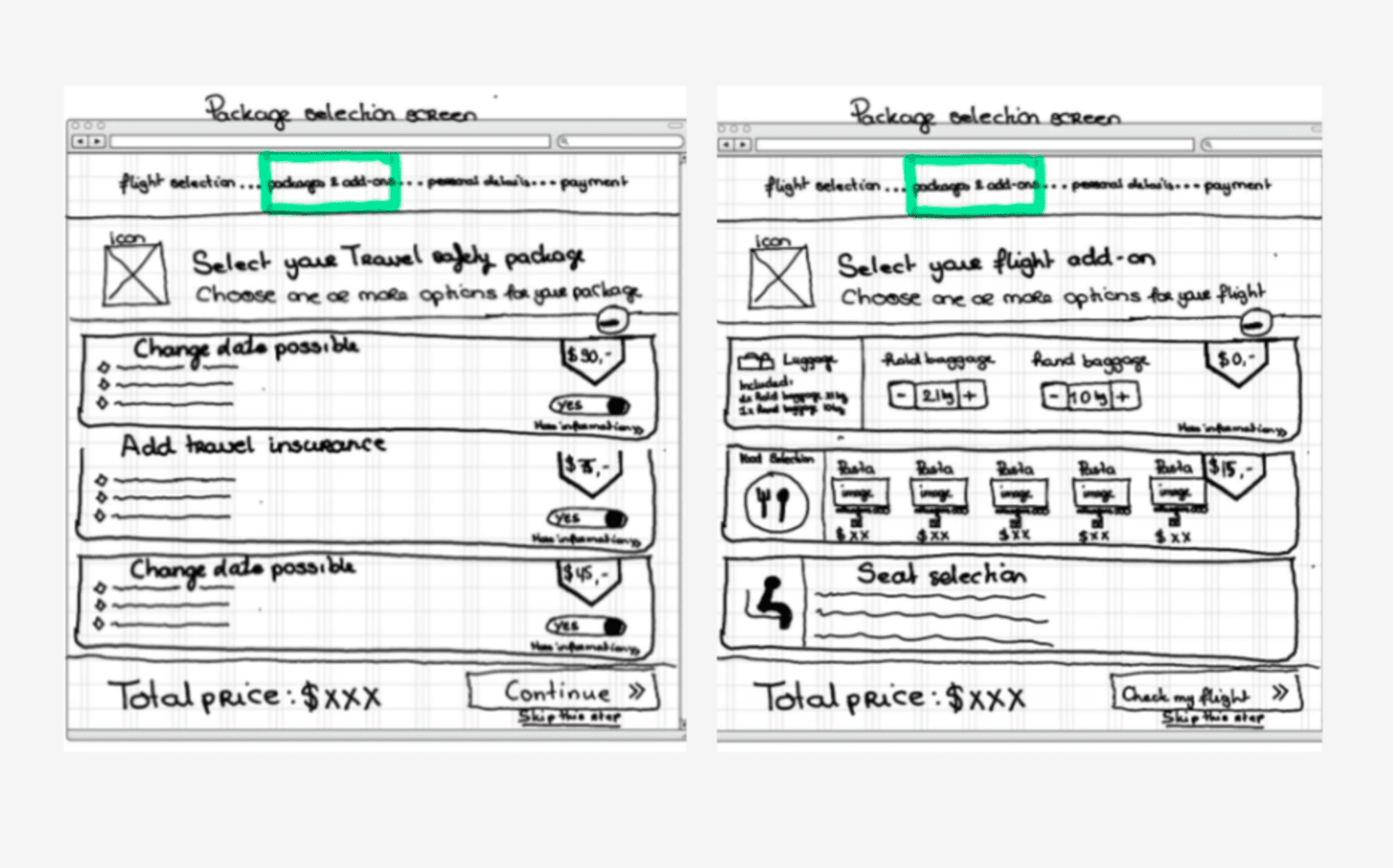
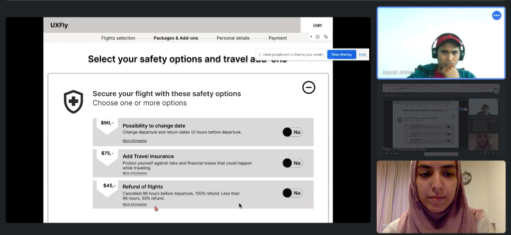
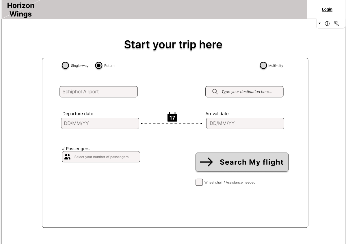
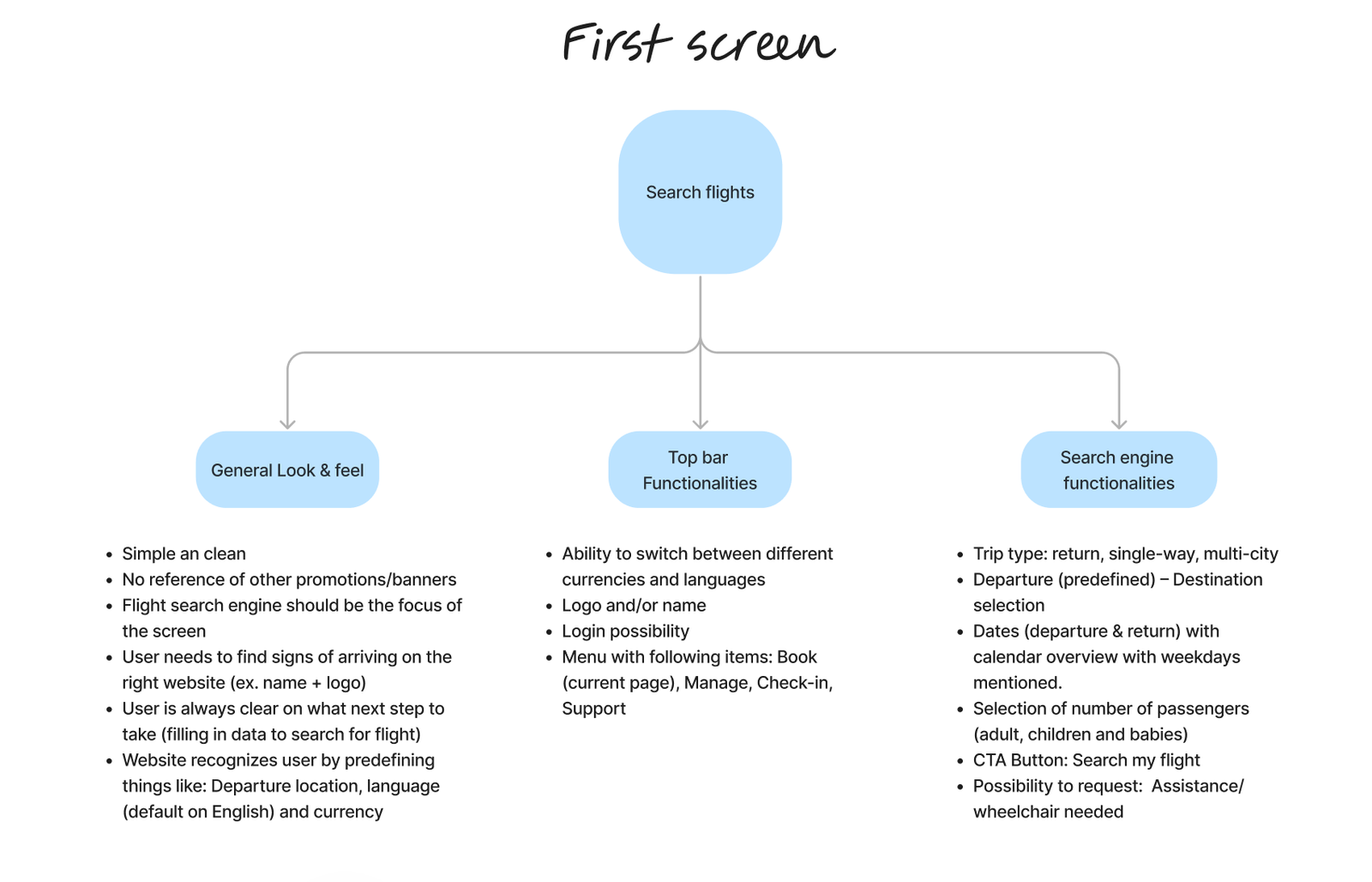
Add-ons
- For the participants the add-ons caused a lot of frustration. This is often the step where they would take the most time or get stuck.Part of this hurdle is because the add-ons were not always part of the progress bar on top. Participants had to select add-ons directly during the flight selection. In my own design I made sure to consider the add-ons a separate step in the booking flow. Through the progress bar on top of each page after the flight search engine I assured that the user always knows which steps they have completed and which ones come next.
Calendar
- Participants liked when a calendar gave feedback when the departure and return date were selected through highlighting the date range. In the prototype I made sure to keep this experience.
Search flight engine
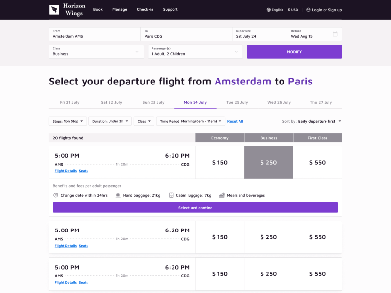
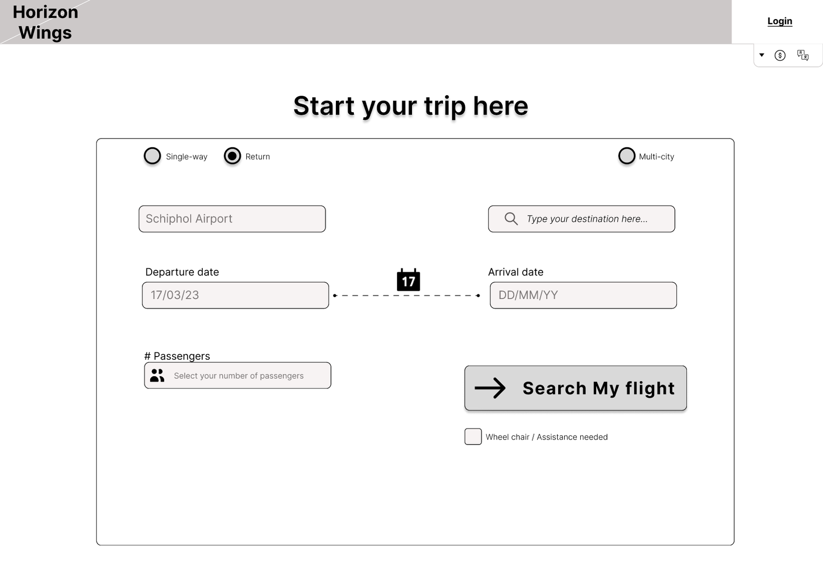
- Majority of the websites tested showed the discount code at the very beginning when searching for a flight. Participants found that this didn't make sense to them as for them a discount code belongs to the checkout step. In my prototype I decided to move the discount code to the payment step.
- In my own prototype I also decided to add icons for the date selection and the passenger field as during the usability tests a few participants passed over the fields and went straight for the search flight CTA.
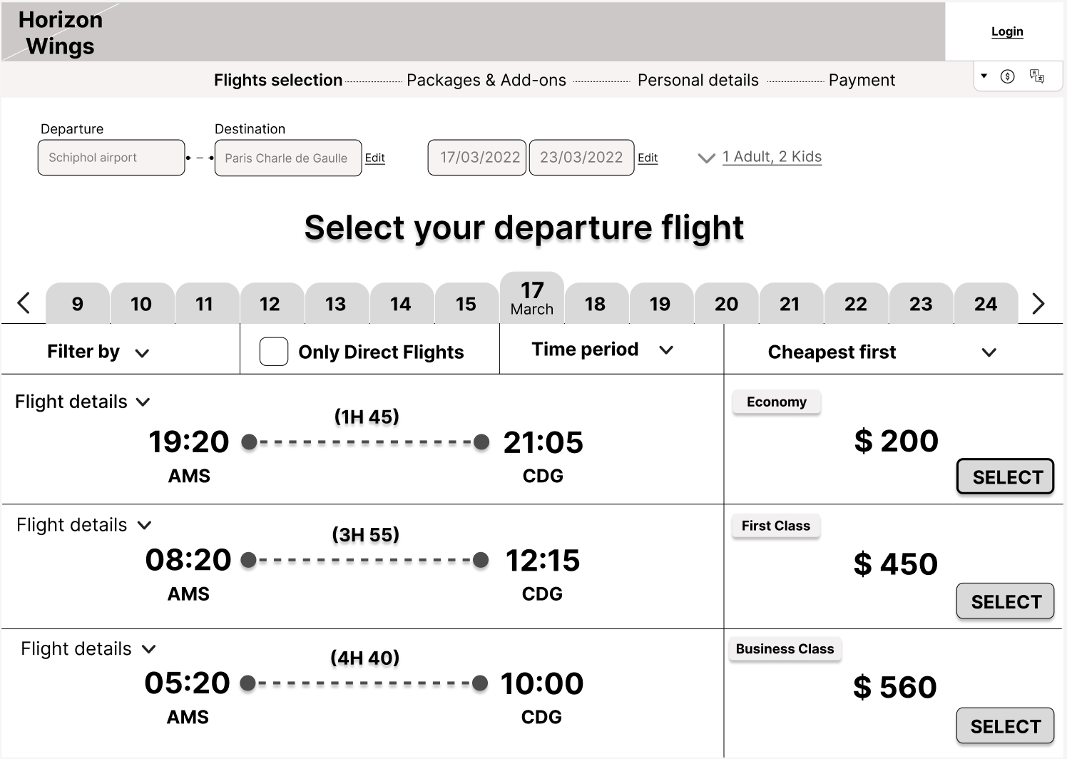
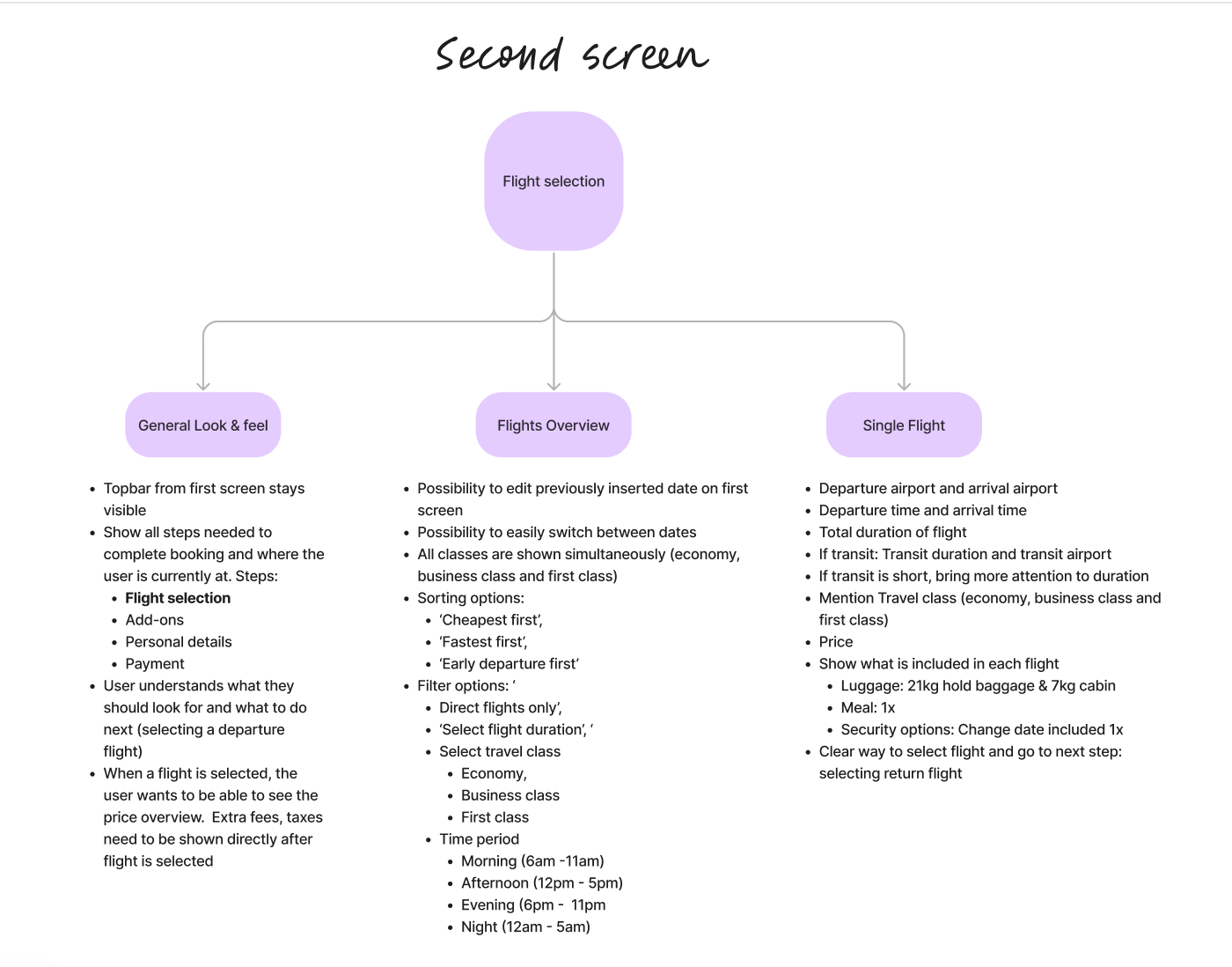
- Flight selection page
Based on the interview I understood that the participants like to test different dates and times before making a final decision. Therefore in my prototype I made it very easy to edit the flight search query right from the flight selection screens. I also created a design where one can easily switch between dates on the search results page without having to edit any search query.
- Add-ons
As mentioned before, for the participants the add-ons caused a lot of frustrations. Add-ons caused the participants to lose time or even get stuck. It was clear from the interviews and usability tests that the participants didnt have much interest in the add-ons. There major interest was in having enough luggage. In my own prototype I decided to add a very clear 'skip' button.
Calendar
During the usability tests the participants mentioned that they appreciate it when a calender highlights the selected date range. This helps them to prevent selecting the wrong date range.
Payment
For the creditcard payment formatting for the input field is error-proof depending on the card used.
Summary
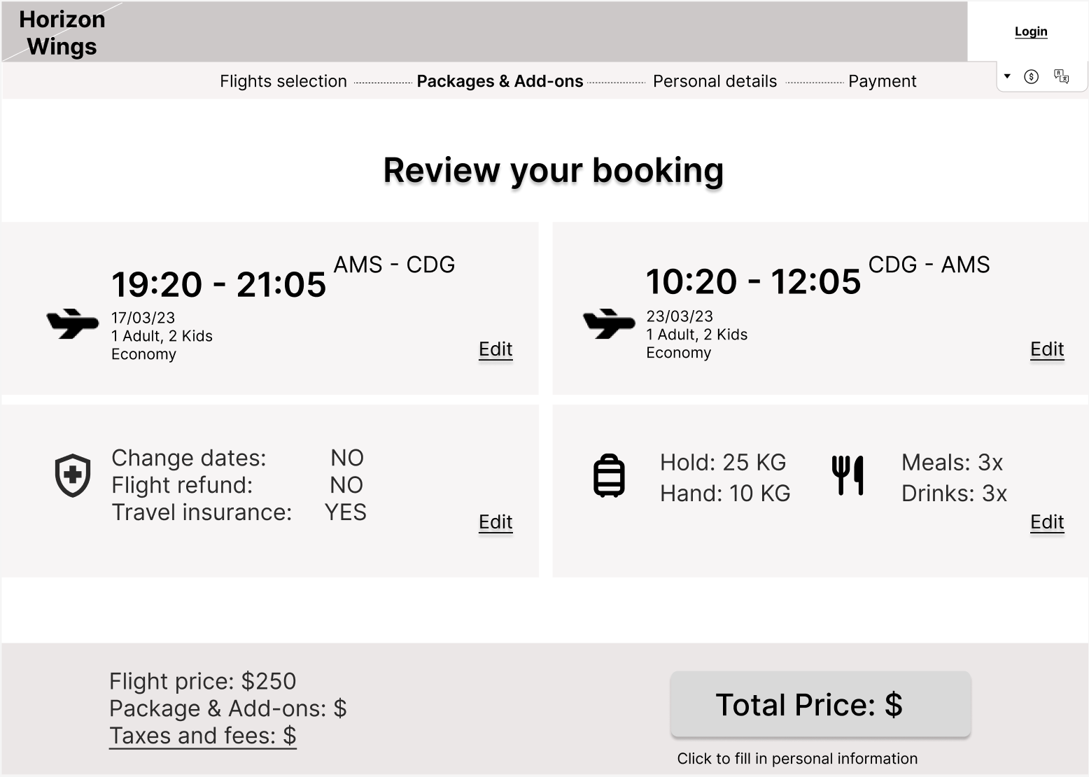
This page is where the user is presented with the selected flights and all the options attached to it. During the usability test it was clear that the participants didn't like spending too much time the details written on the summary. Going too fast during this step might cause users to overlook mistakes. For this reason in my own prototype I made sure to provide a clear summary divided into four distinctive areas.
Homepage
From the usability tests it was clear that the homepages of some of the test websites were considered to be too crowded with different services and ads. For this reason in my prototype the flight search engine has a central position on the position and no other banners or ads are shown.
Validating the Prototype
After working on the mid-fidelity prototype I tested it again with my participants through usability tests where they had to go through a set of tasks that allowed them to go through the whole booking process. There were a lot of positives, but also as expected, some room for improvement. These are the insights from this round of usability tests:
Positives
- All liked the minimalistic design and the focus on the Flight Search engine.
- In my mid-fidelity design, I also added the possibility of requesting assistance and a wheelchair. The participants liked the inclusion and accessibility that resulted from this.
- The ease of transitioning from one date to another within the flight results without having to edit the whole search query was also appreciated
- The number of filters was appreciated as it allowed the participants to really filter based on their needs
- The summary page was very clear and offered the participants a clear overview of what they selected during the process
- The final page of a successful was very much appreciated as it gave the participants useful information (e.g. how many days were left for the trip) and was not too cluttered.
Room for improvement
- The filters on the Flight results should be brought together and take up less space.
- The flight details need to be more clearly visible. Instead of having to click on a separate button for the flight details, participants preferred if details like transit duration and location would directly be visible.
- Participants were confused as to what was exactly included in a flight ticket. This needed to be clearly visible.
- The UI of the add-ons could be better. When adding luggage, the connection between the increase of weight and the price was not clear.
- The UI of the total price was shown as a button to go to the next step. This caused a lot of confusion as the participants didn’t expect it to be a button.
- The verification of the phone number during the personal details steps caused for confusion as it had too many steps
- Participants wished to see the price overview from the very moment they select the departure flight with all fees and taxes
Iteration Based on Feedback
After testing my prototype with a set of participants, I was able to improve my prototype and collaborate with a UX designer to deliver an example high-fidelity prototype. I usually don’t do this step as a UX researcher, as my strength lies in analyzing the data and providing actionable recommendations. However, I decided to add this step to show efficient collaboration with a UX designer in case this is needed for future clients. For the final result please refer to the last section ‘All deliverables’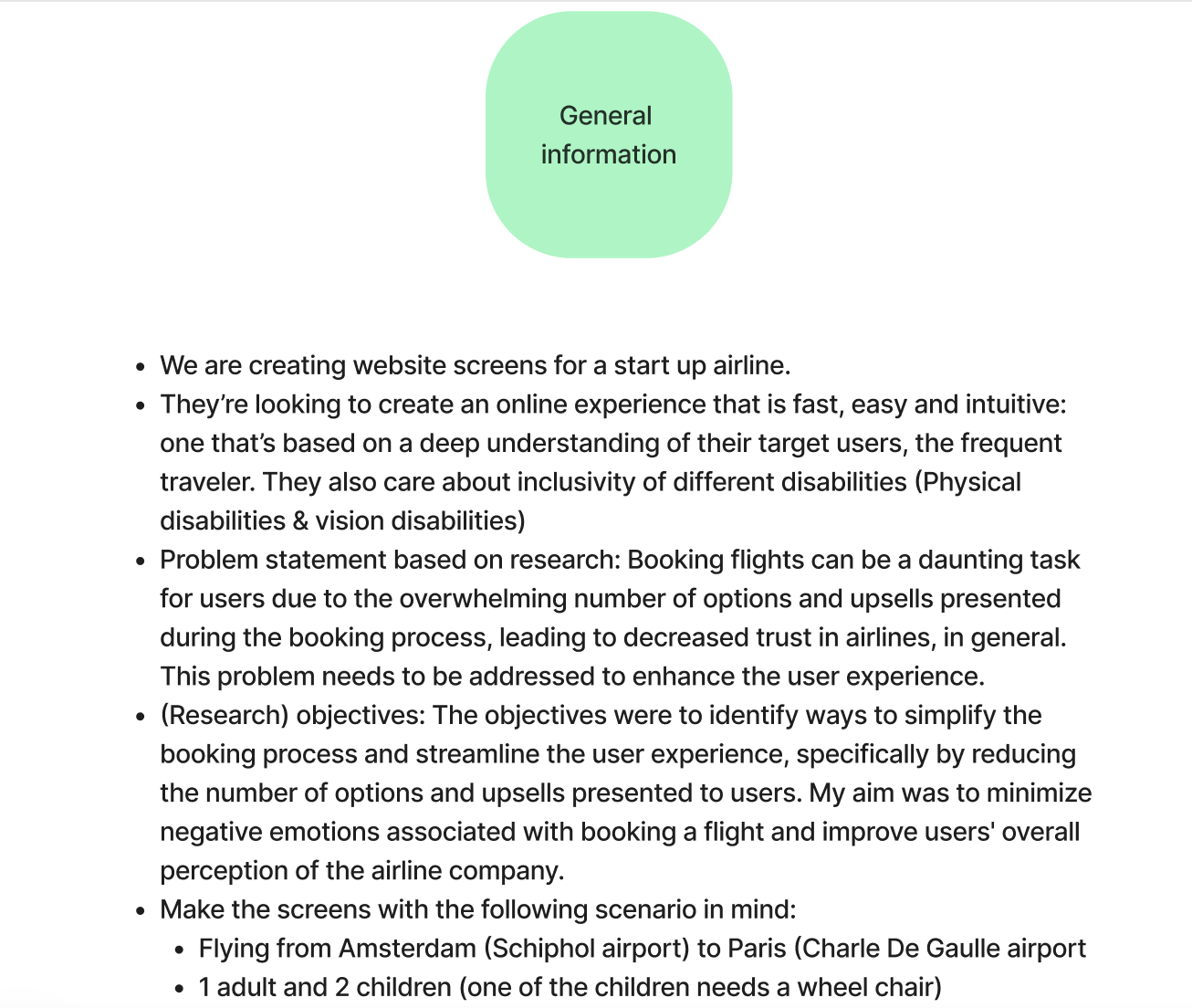
My Research Reflection
This was my first UX project where design was also involved. Through this project, I learned new things like creating prototypes on Figma and collaborating with a UX designer on a high-fidelity prototype.
Another important point is that I did my best to not fully get taken away by the participants’ opinions, but to also keep in mind the business value. In the eyes of the participants, the whole add-ons section was causing a lot of frustration around the price increase and could have been easily omitted. However, for a business, it is important to keep this step in the process to increase the revenue. So through this research, I was able to find a way to please both parties by just restructuring the whole step.
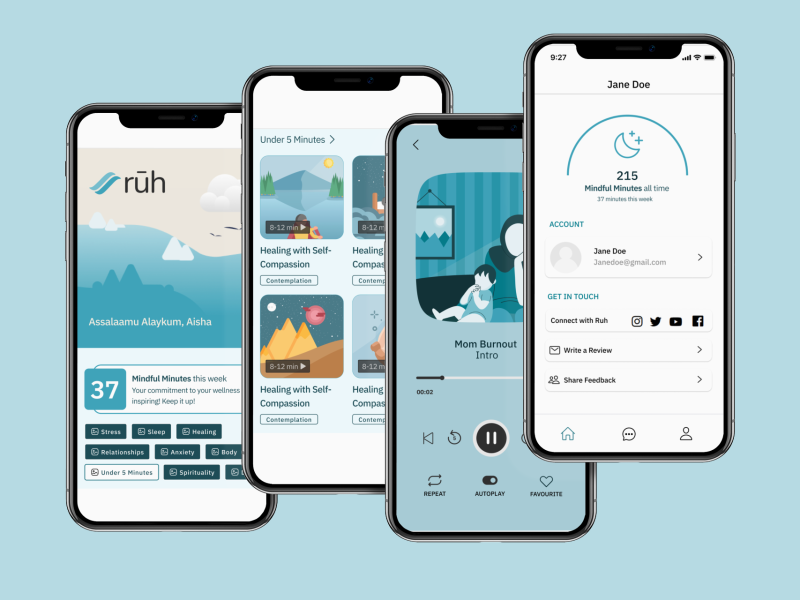
Ruh – The contemplation and meditation app for Muslims
- Client Ruh app
- My role UX researcher
- Team Hayate Ait Bouzid (UX researcher), Asiya Atcha (Product Designer), Ismael Al Saleh (Software Developer)
- Methods Stakeholder workshop, Competitive analysis, Usability test and Interviews
- Tools Miro, Betafi, Zoom, Figma
Investigating the Problem
Ruh app noticed a low retention and engagement for the past months and wanted to increase these numbers. They considered the lack of gamification, customization, and personalization on the app the cause. To uncover the root cause and formulate a research plan I led a stakeholder workshop We discussed potential causes of low retention and identified critical questions. This guided the research objectives. I also explored the team’s assumptions about gamification, customization, and personalization, gaining insights into their vision for these features. It’s worth noting that while the team focused on these areas, I kept an open mind to other potential causes.
Research Objective
Explore and implement different gamification methods, app customization and personalization to increase retention and the mental and faith-based value users can get from the app.
"People want easy. People are coming to these apps because they're already struggling with the complicated lives. They have and they need something to restore order and balance to that. Learning a whole new app for someone who is, anxious or feeling sad, someone who's depressed is gonna be like, I don't want to learn all of this.''
Fatima
Participant about competitor app
Crafting my Research Approach
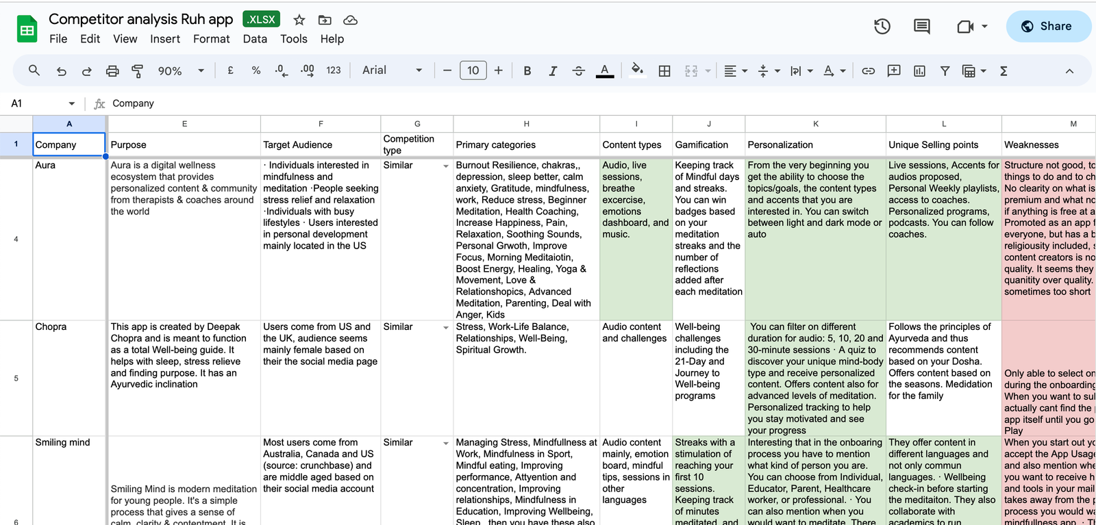
Competitive analysis
Armed with this initial information, I broadened my scope to explore what other mindfulness and meditation apps were up to in this space. Doing this through a competitive analysis, I examined mindfulness and meditation apps, looking at both neutral and faith-based apps I also analyzed their user reviews for additional insights. The findings were compiled into a comparative matrix and then summarized (refer to the ‘all deliverables’ section). This approach helped determine if gamification, personalization, and customization were common competitive strategies among other meditation apps or whether other strategies were used.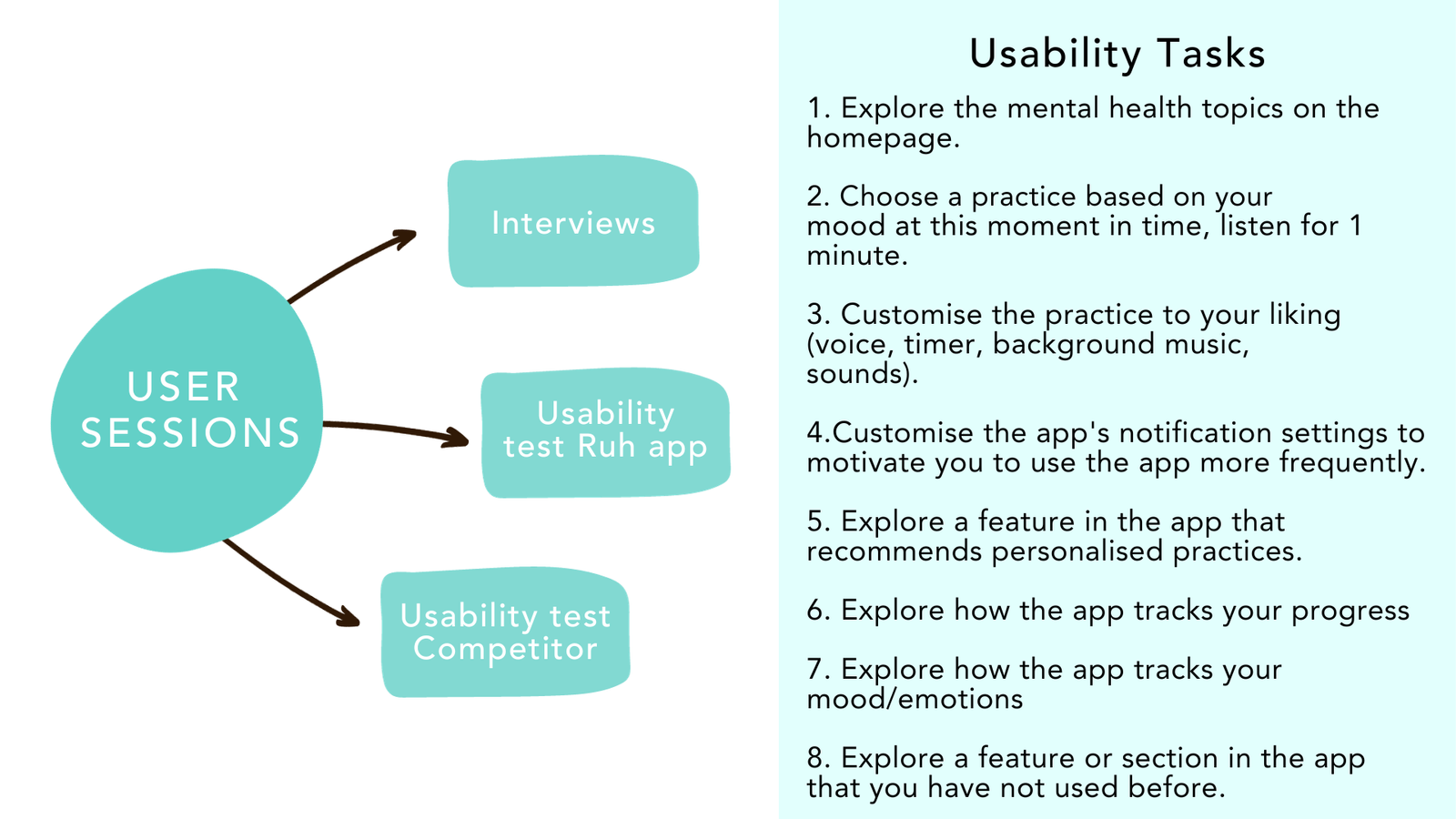 Participants
Recruitment for participants involved social media outreach to find individuals interested in mindfulness and meditation. I also created messages for the Ruh newsletter and their Instagram page, along with recording a video for their Instagram story. My target was 10 -12 participants, eventually I was able to recruit 9 participants. All participants underwent a screening process, meeting specific criteria:
Armed with this initial information, I broadened my scope to explore what other mindfulness and meditation apps were up to in this space. Doing this through a competitive analysis, I examined mindfulness and meditation apps, looking at both neutral and faith-based apps I also analyzed their user reviews for additional insights. The findings were compiled into a comparative matrix and then summarized (refer to the ‘all deliverables’ section). This approach helped determine if gamification, personalization, and customization were common competitive strategies among other meditation apps or whether other strategies were used.
Interviews & usability tests
After the competitor analysis it was crucial to validate certain aspects through direct conversations with actual users of meditation and mindfulness apps, together with understanding their perspectives on mindfulness practices and use of meditation and mindfulness apps. Participants tried both the Ruh app and a competitor app to compare experiences. I selected two competitor apps, including the advanced Balance app, known for its AI-driven personalization. Usability tasks spanned registration, personalization, navigating the home page, and practice selection. This meticulous approach provided thorough user insights.
I opted for these research methods due to the emerging nature of meditation and mindfulness in the Muslim community. To encourage open participation and engage a diverse, global audience, I avoided focus groups, which could be constrained by time zones and participants might be skeptical about opening up in front of others. Additionally, I did not perform a diary study as I didn’t require extensive insights into their mindfulness journeys. Given the project’s limited timeline, my focus was on understanding their current practices, past experiences with mindfulness or apps, and factors influencing continuity or discontinuation.
Participants
Recruitment for participants involved social media outreach to find individuals interested in mindfulness and meditation. I also created messages for the Ruh newsletter and their Instagram page, along with recording a video for their Instagram story. My target was 10 -12 participants, eventually I was able to recruit 9 participants. All participants underwent a screening process, meeting specific criteria:
- Age Range: 18-60 years
- Muslim
- Speaks English
- Interest in Mindfulness and/or personal growth
- Owns a smartphone
- Previous use of Mindfulness apps or tools (like journaling)
My analysis in images
To get access to the deliverables in detail, scroll down to the section ‘All deliverables ‘


From Obstacles to Opportunities
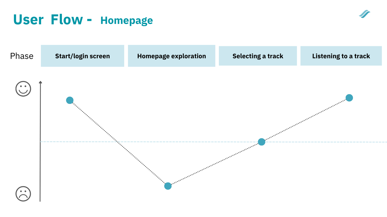
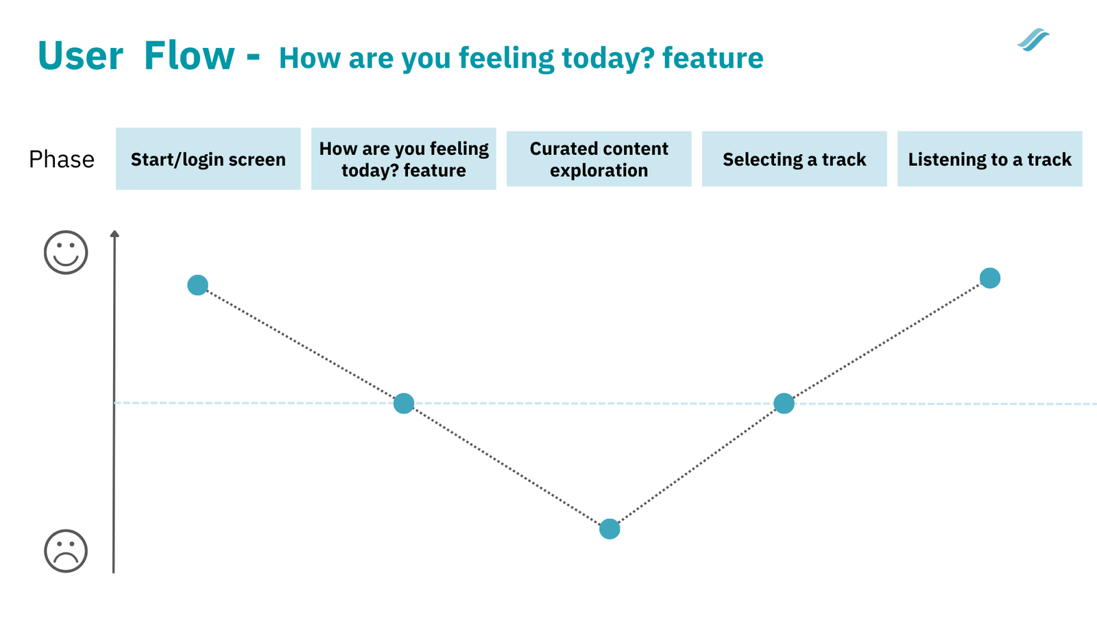
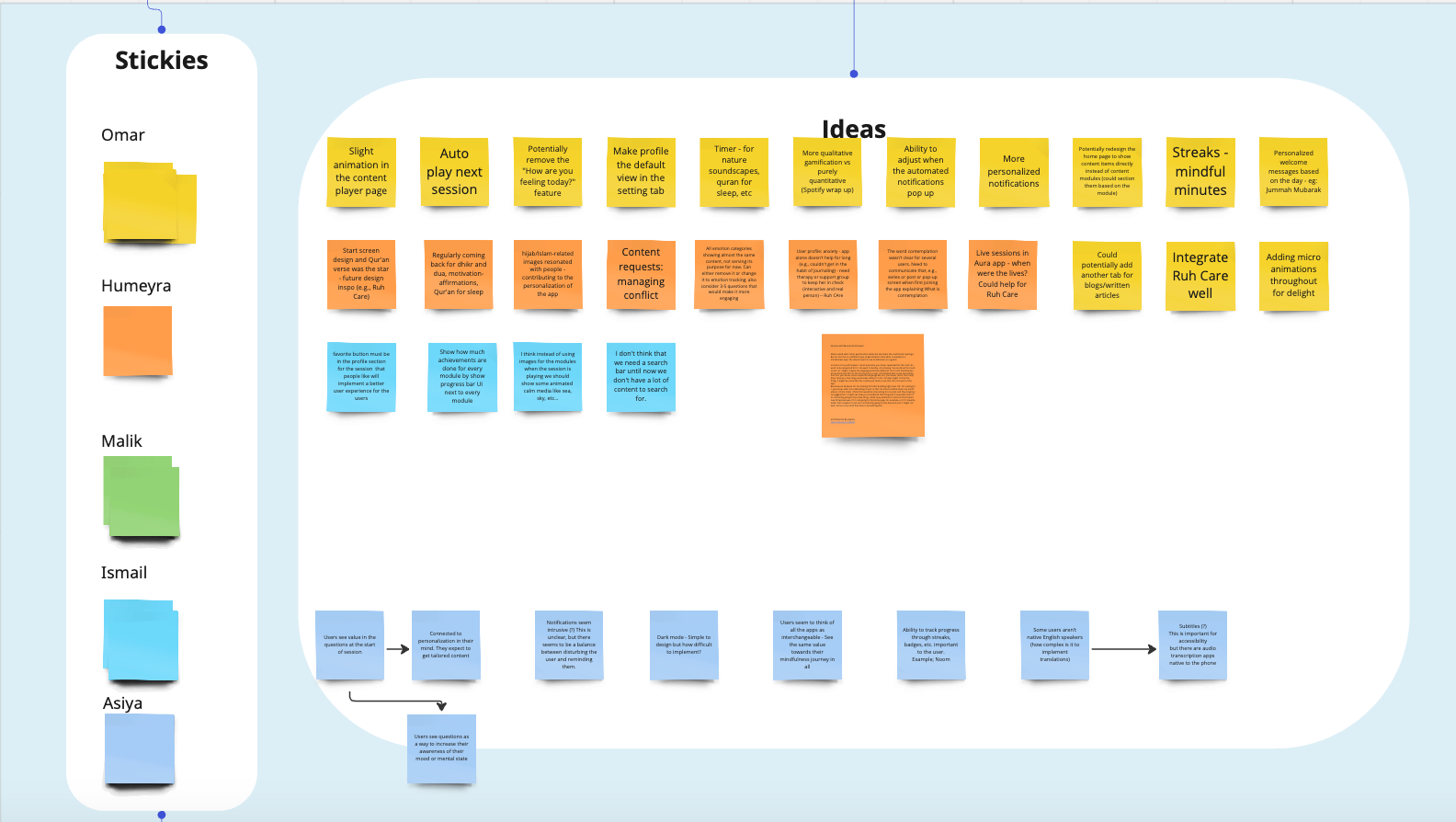
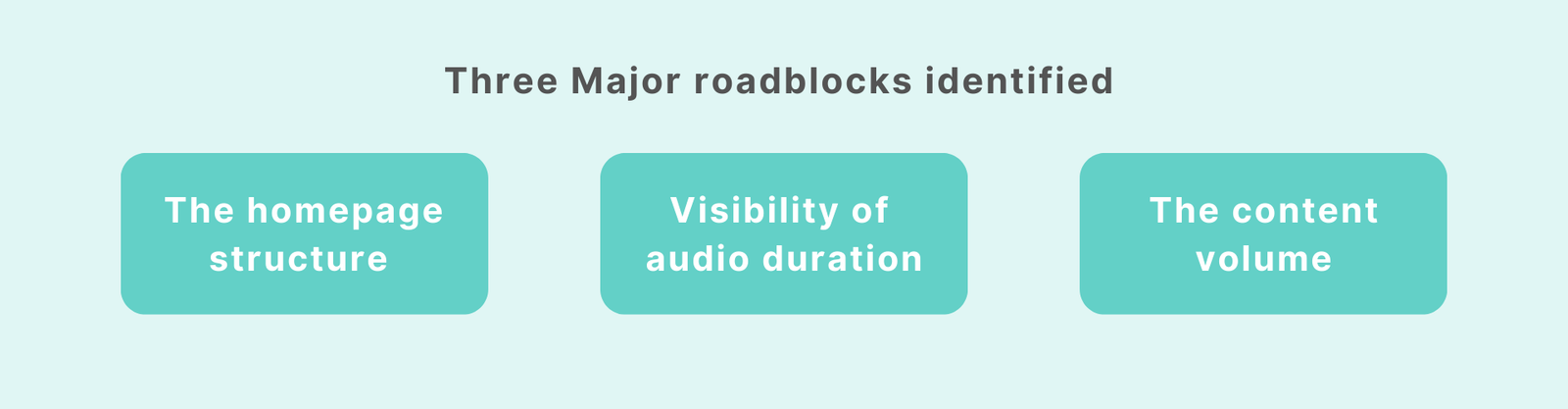
After conducting the interviews and usability tests, I analyzed all the transcriptions and notes. It was a manual process where I searched for patterns across the complete dataset. Later, I decided to bring the Ruh team for an affinity mapping workshop to uncover themes that could have been missed during the first analysis. Additionally, I created user journeys based on the two main ways a user could navigate through the app. This allowed me to analyze each step of the process in detail and see where the main hiccup is for the low retention numbers. This helped me identify three major blocks in the app.
Apart from that, during the data analysis process, I discovered many strengths that could be used by the Ruh team to emphasize more during their branding and marketing. These have also been communicated with the team.
In the next section, I go into the detailed insights and recommendations.
Detailed insights & recommendations
Participants need more content and feel overwhelmed with the current homepage structure
Insights
Recommendations
User Quotes
Insights
- Most participants observed a lack of content. The participants reasoned this by associating it with the immaturity and incompleteness of the app.
- The total duration of all tracks shown on the homepage was causing most participants to not want to click on a series.
- The content on the ‘all’ category on the homepage is experienced as ‘overwhelming’. Better categorization is needed.
- A few participants mentioned that the topics are not all encompassing.
Recommendations
Adding more clarity to the homepage will increase engagement with the content and app in general
Recommendations based on Ruh solely
Categorise the ‘all’ section of the homepage better, or show content that is relevant to the user by understanding their needs first (more on this later).
- Consider categorising content based on user needs/goals (e.g anxiety) – insight from competitor analysis.
- Be clear on what a contemplation is.
- Move away from showing total duration of series.
- Provide a basic Islamic meditation series, this is a low barrier introduction to the Ruh app, especially for users that are not sure if meditation and mindfulness are ‘Islamic’.
User Quotes
“Four tracks – 7 to 13 minutes, I think it would probably be beneficial to have that on the home screen or to indicate that it’s not 41 minutes. There are four different tracks because I wouldn’t have clicked on it otherwise, if you hadn’t prompted me” – Participant
”I think it just needs more content for it to be more helpful. The Balance app has more content and thus makes it worth paying for” – Participant
Participants want to feel that the app is interested in them & their needs
Insights
Recommendations
User Quotes
Insights
- Participant cannot adapt the session/tracks to their needs (e.g duration, voices
- The profile tab opens on the settings page
- The profile page is considered basic and is missing crucial elements of a profile page
- Favorite button and ‘create playlist’ function missing
- App doesn’t track usage of users to make the experience more personalised (e.g reminders based on past usage, needs or goals)
- A few liked the possibility to change the look and feel in the comparitive apps
Recommendations
Structure of the Profile and Settings page

In the full report I also gave recommendations around onboarding questionnaires in case it was desired to be added to the app.
User Quotes
“Again, more personalized questions. Like now that I know that there’s a profile, like all it has is my first name. Like that’s all it kind of knows about me. So again, like primary struggle why? Because people if they’re downloading these apps, especially mindfulness apps, they have a goal. (…) Ask more questions and you have almost a snapshot of the persons mental health at that moment. ” – Participant
Participants find pleasure in tracking their progress and striving towards a meaningful goal, as well as feeling valued for their efforts.
Insights
Recommendations
Insights
- Some participants disliked the idea of badges because they give a ‘childish’ value to mindfulness.
- Some participants didn’t understand the concept of levels (Aura app) within mindfulness and meditation.
- One participant mentioned that gamification should not make an anxious person feel bad about their progress.
- A few participants were keen on knowing what skills and tools they are learning from a session to make sure they can take it with them in their daily life.
Recommendations
Recommendations – Gamification
- Allow users to track their progress
- Badges didn’t score well during the tests, visually moving towards a specific goal would be more helpful*
- Consider adding value by being clear about the skills a user is gaining from a specific session (e.g less reactiveness, body awareness).
- Bring the goal screen when registering to all entry points and make it editable from the profile page
*Could have been different with an equal gender ratio among participants.
Recommendations – Notifications
- Appreciative notifications are considered a motivation and stimulate to visit the app
- Direct example wording for notifications given by participants:
- ”You’ve been using the app for an entire week, we’re happy to have you in our family for a whole week” – Participant
- ”You listened to self compassion today, have you found yourself practicing it?” – Participant
Participants like aesthetically pleasing designs that show app maturity and set the participants in the right mood
Insights
Recommendations
Insights
- One participant wished the design to be more sophisticated. Words like ‘childish’, ‘cartoony ‘ and ‘immature’ have been mentioned.
- Within the sessions some participants mentioned that the images are too basic or don’t represent the topic of the session well
- A few participants mentioned that they really liked the animation and transitions from the comparative apps, this is missing in the Ruh app
Recommendations
Recommendations – Design
- Revise the designs of the series images (the images above the introduction of a session, need the most attention).
- Consider looking into the type of graphic design used currently, to avoid it being identified as childish, immature.
- Consider adding more animation when interacting with a session/track. They set participants in the right mood before starting or when completing a session (this was also mentioned in the affinity mapping session).
- Consider updating the design of the player, it is currently considered as basic by some participants (elements as favourite button, ‘add to playlist’ feature can also be a great addition).
- Consider adding a dark-mode, especially for the player.
My Research Reflection
This research held a personal significance for me in various ways. It enabled me to gain a deeper understanding of the users, particularly as someone who shares an interest in mindfulness and practices meditation as a Muslim. This connection allowed me to empathize with their needs and concerns. Nevertheless, it’s important to acknowledge that this closeness could have potentially led me to overlook subtle factors that might have influenced my analysis.
During the participant recruitment process, there were some delays on the client’s end, resulting in a smaller sample size of 9 participants. Additionally, the uneven gender distribution may have had an impact on the data outcomes, particularly in relation to badge preferences. The research findings revealed that of the participants (N=9), all 7 females were not in favor of badges as part of gamification on the app, whereas all 2 males were in favor. Therefore, in relative terms, the majority expressed a lack of preference for them. This information was explicitly outlined in the report, along with the acknowledgment that an even gender distribution could potentially yield different outcomes regarding badge preferences.
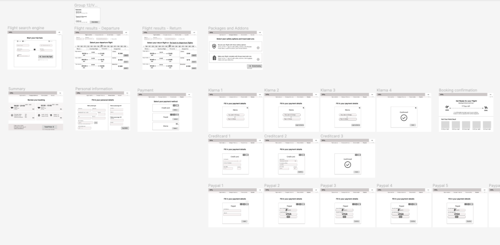
All deliverables
- Research plan
- User journey (homepage)
- User journey (how are you feeling today?)
- Affinity mapping workshop outcome
- User personas (visible under ‘My analysis in images’)
- Competitor analysis summary
- Competitor analysis matrix